My Favorite Album Covers
I'm starting the process of working with a graphic designer on the album art of Calling All Dawns, and so I figured this might be a good opportunity to organize my thoughts on just a few of my favorite album covers, especially as they might apply to my own album art design. You'll notice that, for the most part, they come from just a few bands and labels; that's because on the whole, there are certain elements that I am repeatedly drawn to, and certain things that I shy away from (for example, there are very few album covers that actually *show* the musicians, that I find interesting). And on the whole, many of the more unique bands maintain a consistency of brand image from album to album--so again and again, if I really like a band because of their pioneering qualities as artists, chances are I'll consistently like the decisions they make with regard to cover art.
Take Radiohead, for example:
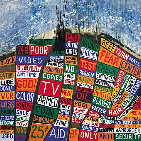
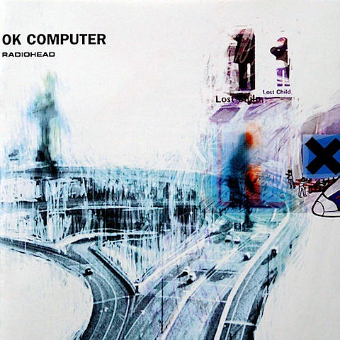
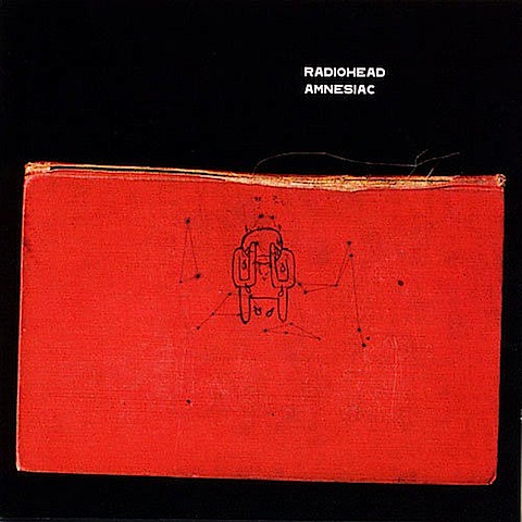
Hail To The Thief is probably my all-time favorite album cover (despite being a rip-off of Paula Scher's work). First off, I like the hand-made feeling of it; the texture, the imperfect lines... It's abstract and compelling, and befits the haunting and moody qualities of their music beautifully. And likewise, it looks like 'real art'--if you didn't know anything about the product, you would be hard pressed to guess that it was an album cover. Similarly, OK Computer and Amnesiac remind me of Robert Rauschenberg and Mark Rothko respectively.
All my life I've been drawn to ECM Records' New Music Series.
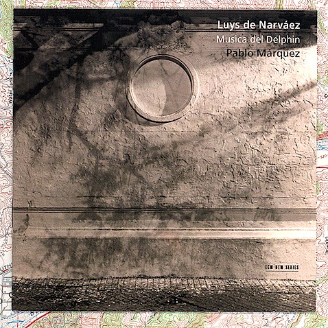
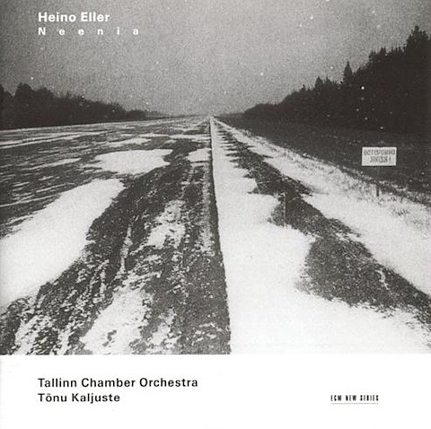
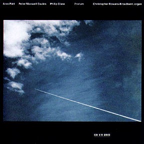
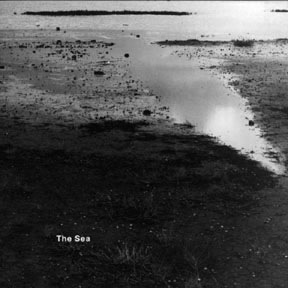
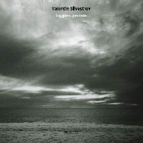
Again, they're very abstract covers; black and white photography, very understated images (yet rich and full of depth and detail). Occasionally they border on the sentimental and new-age, but on the whole they stand alone as works of art, and aren't terribly explicit about the music contained within (both traits that appeal to me).
This Modest Mouse cover is something I just stumbled across while researching this blog post, but I quite like it as well:
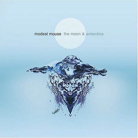
In addition to the understated color palette, I also like the unidentifiable image in the center (presumably it's Antarctica? Looks more like a rorschach blot to me). I also like the symmetry of the presentation; matter of fact, I tend to lean towards simple graphical images that are presented front and center (pretty much all my t-shirts sport graphics that follow that simple template).
Of all the Rolling Stones album covers out there, most of them are pretty hideous in my mind, but the one that I like is from their live album Flashpoint:
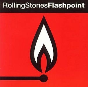
It's so simple. So powerful. The text setting (Helvetica?), the use of a regular-typeface followed by a bold one, the iconic imagery....it totally works for me.
I really enjoy powerful, bold, iconic imagery--but the problem is, this is somewhat at odds with what I said before, about liking abstract, nuanced, understated works of art. But I'm allowed to have more than one preference, correct? I think for Calling All Dawns, though, something more akin to the former (abstract works of art) is probably more what I'm going for.

Zero 7 has a couple winners. I like The Garden quite a bit; it appeals to the part of me that likes collages, like Rauschenberg's works. I also like the texture of the torn edges of the page; on the whole, I like graphics that carry implied textures and processes: for example, the feeling of cloth and paper, or the sensory act of tearing, stamping, searing, burning, sketching, and drawing. If you look at my Tin Works scoring portfolio and look at the brand that was created for me, the logo is slightly grainy and faded; like it had been applied with a rubber stamp. This was something I was quite insistent about; I wanted something with a strong sense of texture, and a feeling of hand application.
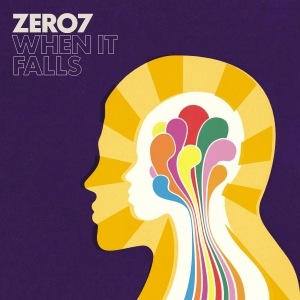
As for the When It Falls art, that appeals to a totally different (and totally inapplicable) pleasure center of my brain; the part of me that likes retro colors and images. Again, totally inapplicable to Calling All Dawns, but still something I enjoy quite a bit.
By far my favorite band growing up was Pink Floyd, and a number of their album covers are Hall Of Fame-worthy:
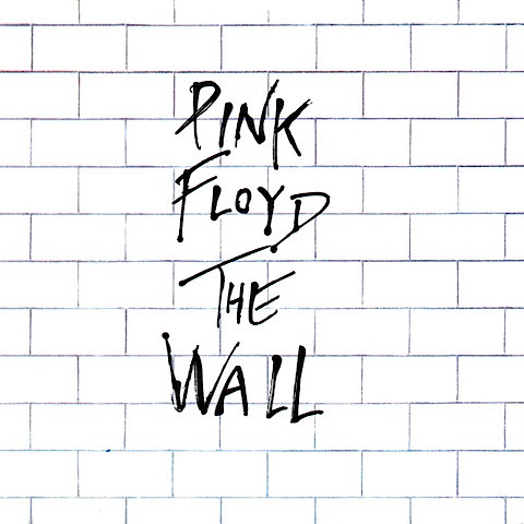
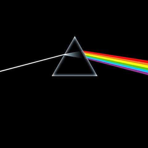
Again, these were bold, simple images. Not quite the textured works of art that I liked with Radiohead, but still simple, powerful and abstract. The Wall in particular was a teenage favorite; I was ridiculously obsessed with that album, especially the way it (and Dark Side Of The Moon, for that matter) was a musically unified concept album, that started and ended as an infinite loop. I was blown away by this concept, and lo and behold, fifteen years later when I go to release my own debut album, what do I go and do? Make a concept album that starts and ends as an infinite loop. Go figure.
Two of my favorite electronica albums are Verve Remixed 1 and 2:
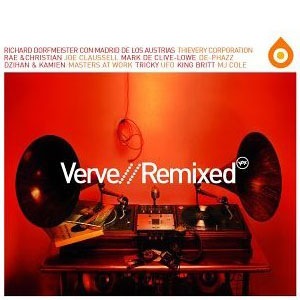
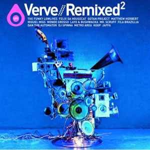
Seriously cool album covers, but mostly because of the works of art that were created for them, that pretty much encapsulate the essence of the albums: that is, taking old jazz records and remixing them. Absolutely love the concept, but I'm hard pressed to find any similar approach for Calling All Dawns (nor do I plan on making my graphic designer create a sculptural work of art like that).
Finally, my all-time favorite band has two clear winners:
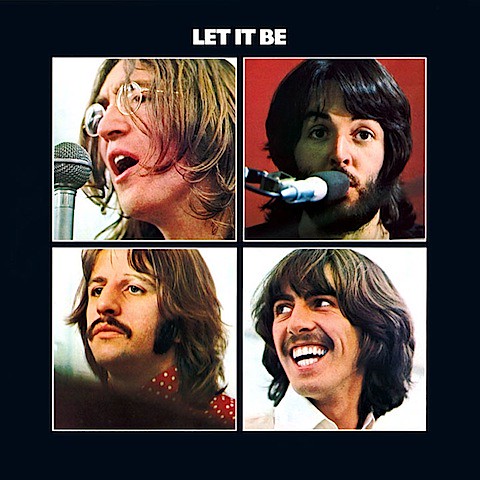
Let It Be is perhaps the only album cover that I like that features the band members. Why? Well, for one it's not one picture of the entire band together, but rather four GREAT portraits of the Fab Four, arranged in a simple, geometric layout. It comes at the end of their career, so it's rather fitting that the four are not shown together in a single frame; but at the same time, it brings a flood of nostalgia, of remembrance of the good times that we all had listening to their music on our old record players. This album cover probably violates the majority of artistic principals I have for the medium; but it just works so well and hits home in the context of the whole Beatles experience, and what it means to me.
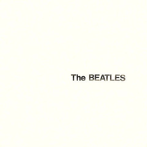
And as for The White Album, it's simply beautiful. (The fading on the text is nice, too, though I'm not sure if that was a part of the original.) Simple, clean, and forceful.
posted by Christopher Tin at
3:20 AM
![]()
![]()


10 Comments:
Without any doubt, my favourite album cover belongs to a vinyl of the Original Score composed by Marvin Hamlisch for "Sophie's Choice"...an oustanding work of art...in the image...in the music itself...
http://www.youtube.com/watch?v=9InOeywj9n0
November 11, 2008 at 11:24 AM
債務整理 相談
新規事業
多重債務 相談
ノベルティ
カップリングパーティー
カップリングパーティー
治験
過払い金変換請求
オフィス家具
ボート免許
水上バイク
ジェットスキー免許
バイク便
妊娠 症状
投資情報
介護予防
不動産
任意整理
東京 ホテル
防水工事
大学留学
水道修理
ナース通販
エアコンメンテナンス
府中 不動産
太陽光発電
アルギニン
募金
家具
オーストラリア大学院
ニュージーランド大学
高級賃貸
内装工事
インプラント 大阪
川口市 一戸建て
朝霞市 一戸建て
松戸市 一戸建て
三郷市 一戸建て
上尾市 一戸建て
業務用エアコン
結婚相談所
ワイシャツ 通販
ウェディングドレス
相続税対策
地デジ工事
まつ毛エクステ
リンナイ ガス給湯器
新規事業
債務整理 平塚
カフス
August 11, 2009 at 7:31 AM
hm... i like radiohead album cover, it's so briliant :)
July 16, 2012 at 7:38 AM
Radiohead is my favorite band,thank you for sharing this information.
If you want to know more about Quickbooks error 404 and how you can rectify it check How to fix Quickbooks error 404
February 11, 2021 at 11:48 PM
The QuickBooks Connection Diagnostic Tool can be used to diagnose QuickBooks issues. These files can be used to resolve errors that occur while running QB programs. software. It is simple to set up the QuickBooks Connection Diagnostic Tool. This is recommended if the user wants to run QuickBooks Software with the proper Microsoft features.
QuickBooks Connection Diagnostic Tool
January 31, 2022 at 4:12 AM
스포츠토토티비
스포츠토토
해외스포츠중계
It's going to be finish of mine day, but before end I am reading
this wonderful article to increase my experience.
February 20, 2022 at 4:51 AM
토토사이트
프로토
사설토토
Thanks designed for sharing such a nice thought, paragraph is nice, thats why i have read
it entirely
February 20, 2022 at 5:01 AM
I felt this would be a good way to arrange how I felt about some of the best record covers, particularly in relation to how they might relate to our own album art design. You'll notice that they mostly originate from a small number of bands and labels; this is because, generally speaking, there are some aspects that I find appealing and others that I avoid (for instance, there aren't many album covers that truly *show* the musicians). I have heard your work before and I think it's really fantastic. I truly like what you've got here, and I especially like what you're saying and how you're saying it.
ley de divorcio nueva jersey
November 2, 2023 at 6:26 AM
Unlock the secrets to passing the Oracle 1Z0-997-24 exam with flying colors! Our 1z0-997-24 Dumps provide comprehensive coverage of Oracle Cloud Infrastructure Enterprise Manager Cloud Bridge Administrator exam topics, ensuring you're thoroughly prepared to ace the test. With our user-friendly interface and up-to-date questions, your success is guaranteed!
July 30, 2024 at 3:32 AM
I really enjoyed reading your thoughts on album covers! It’s interesting how they can evoke nostalgia or capture a moment in time. sex crime lawyer new jersey
new jersey sex crimes lawyer
October 16, 2024 at 12:42 AM
Post a Comment
Subscribe to Post Comments [Atom]
<< Home